
04 Feb Render to Reality | Chelsea Court Main Floor Remodel
It’s a tale as old as time. Blind as a bat marries analysis paralysis and then they buy an amazing house that they want to make their own. After tackling some smaller projects, they realized a remodel of multiple spaces was more than they were comfortable with so they enlisted the professionals at Times Two Design Co.
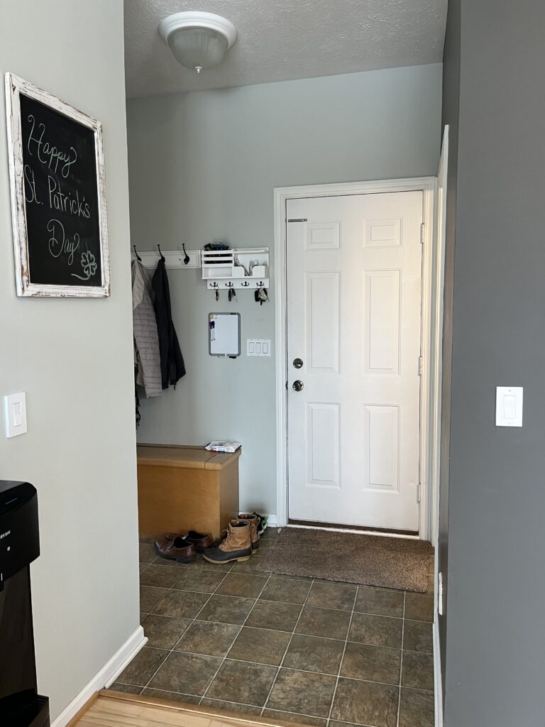


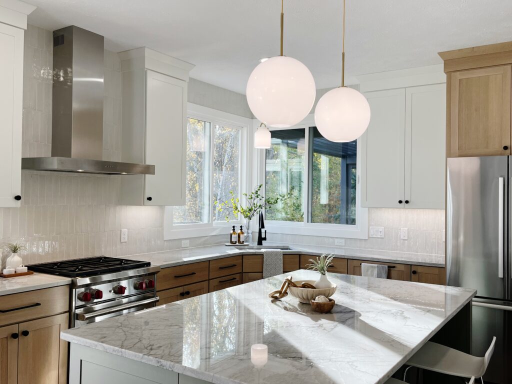
The clients knew what they liked when they saw it but until then, they just couldn’t put it all together. But they knew one thing for sure…the corner sink was not working for them! After receiving a beautifully organized list of things they wanted to incorporate into the space, we dove straight into our design interview with a more detailed conversation about how they wanted to use the space, their style, and their budget. Again and again, that darn corner sink was the topic of their pain point.
In our creative process, we discovered that it wasn’t the corner sink that was the issue. Aside from the aesthetic not being what they were drawn to, it was being cut off from the dining room and the large amount of wasted floor space in the center of the kitchen was causing them to dislike it.
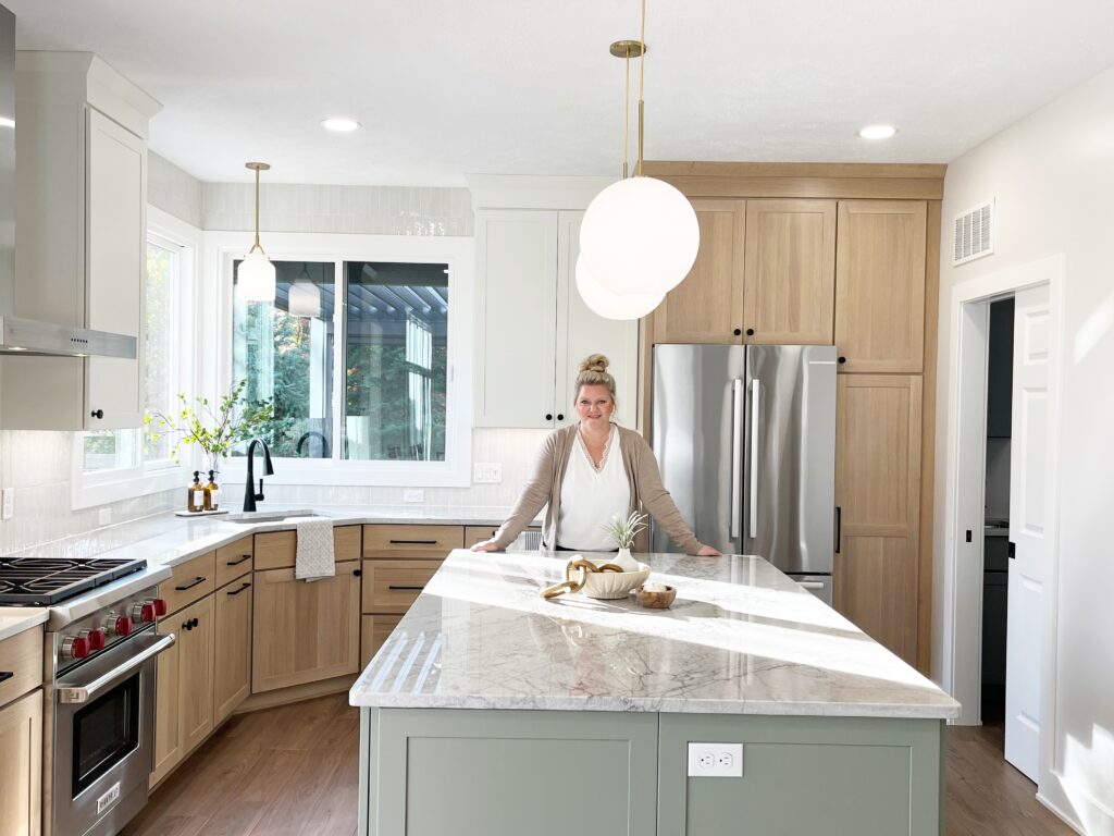
We presented the two designs, and because of our findings, one of the designs we presented was an upgraded layout that kept the sink in the original corner location because it worked so well with all of the other layout changes we made. Never say never!


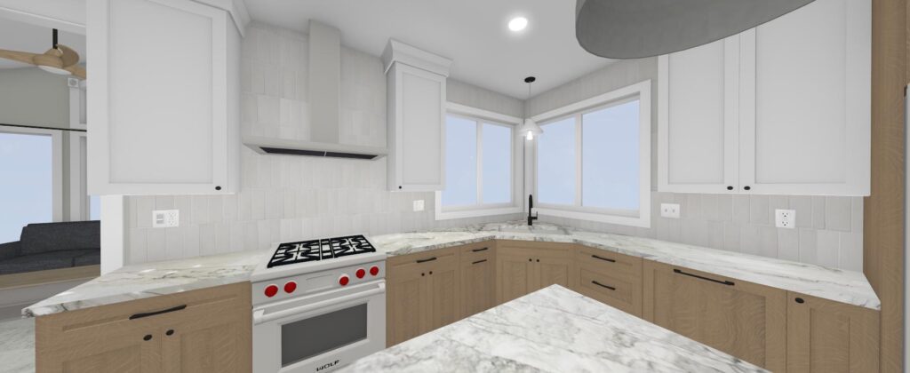


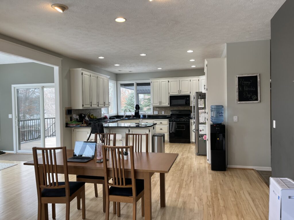
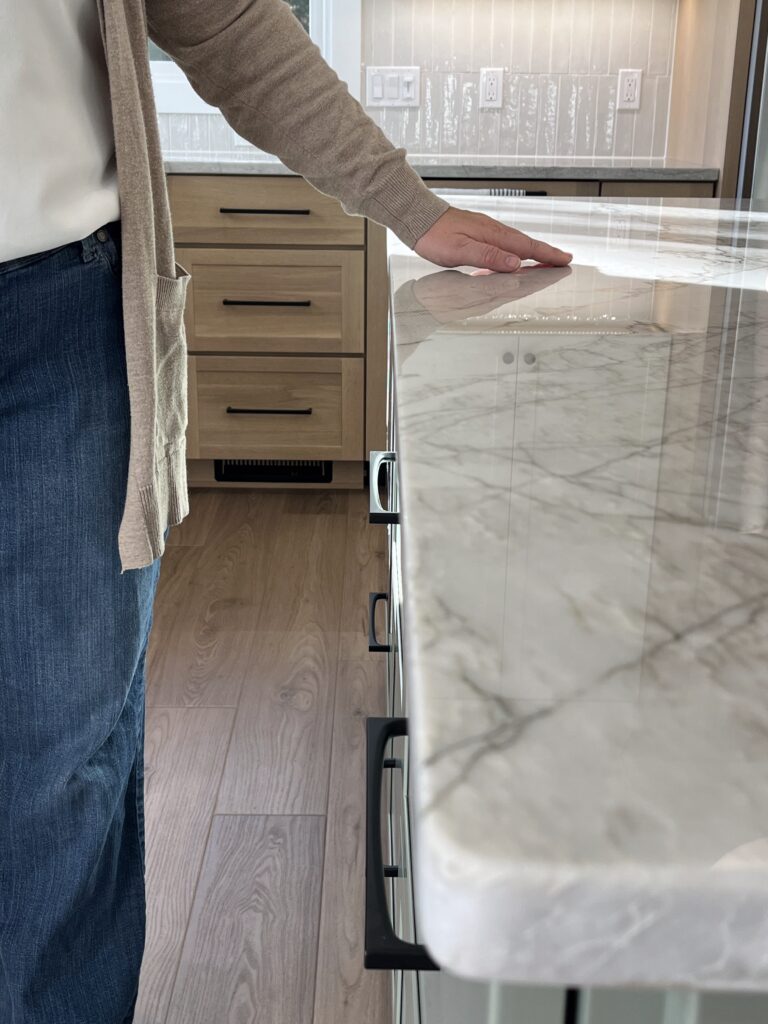
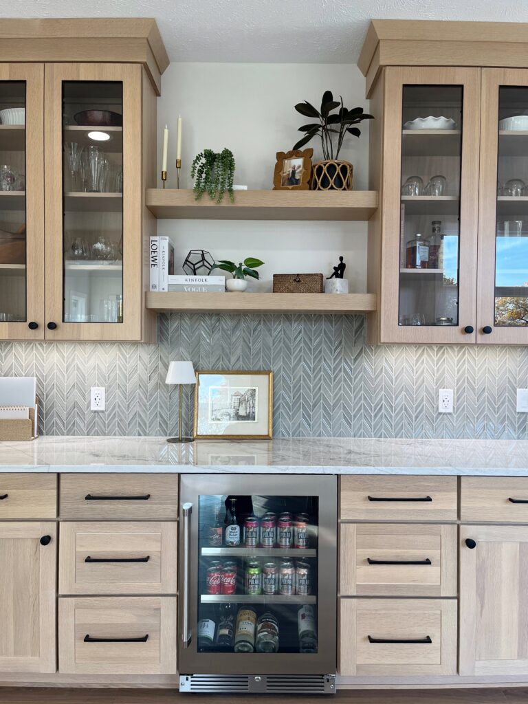
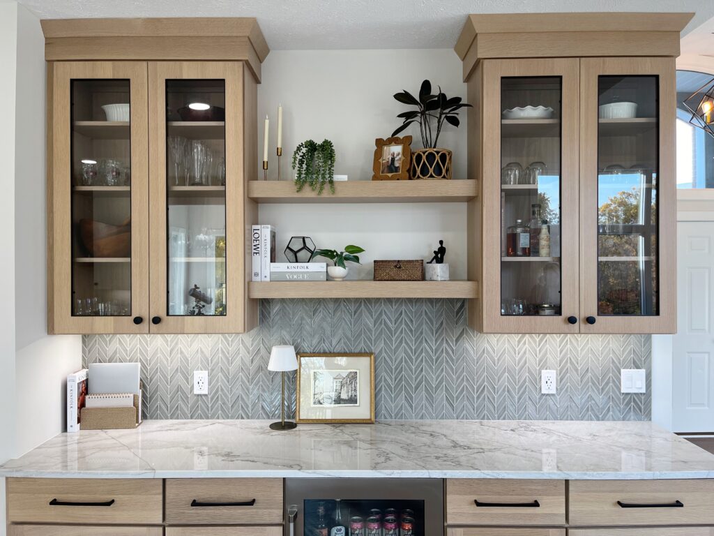
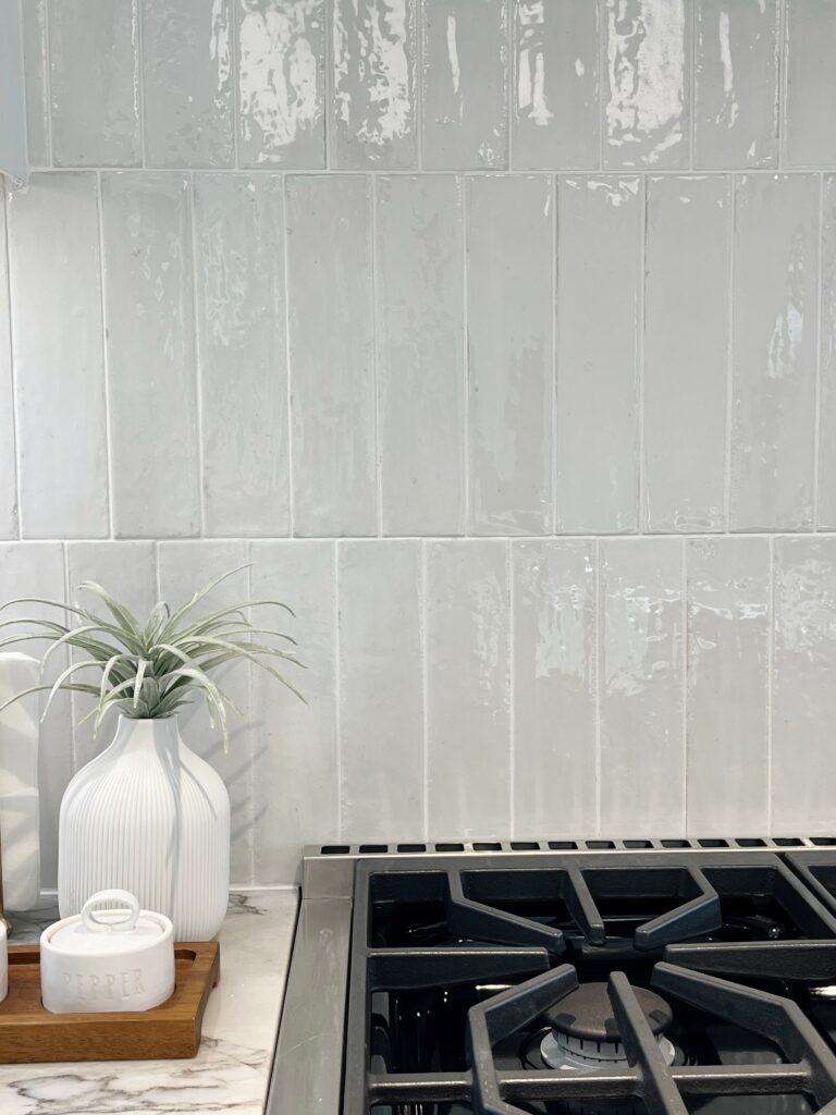
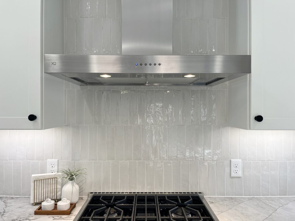
A combination of using soft masculine materials, bringing wood elements throughout each space, and lightening up the weight of cabinets by adding glass makes for a dreamy palette. Using three finishes on the cabinets including a bold black accent while adding plays on pattern and textures to the backsplash elevates the room. Being complimentary to each other, your eye travels from one pretty thing to the next. You can’t help but want to feel those gorgeous countertops, that are also quite forgiving in the crumb department if you ask us!


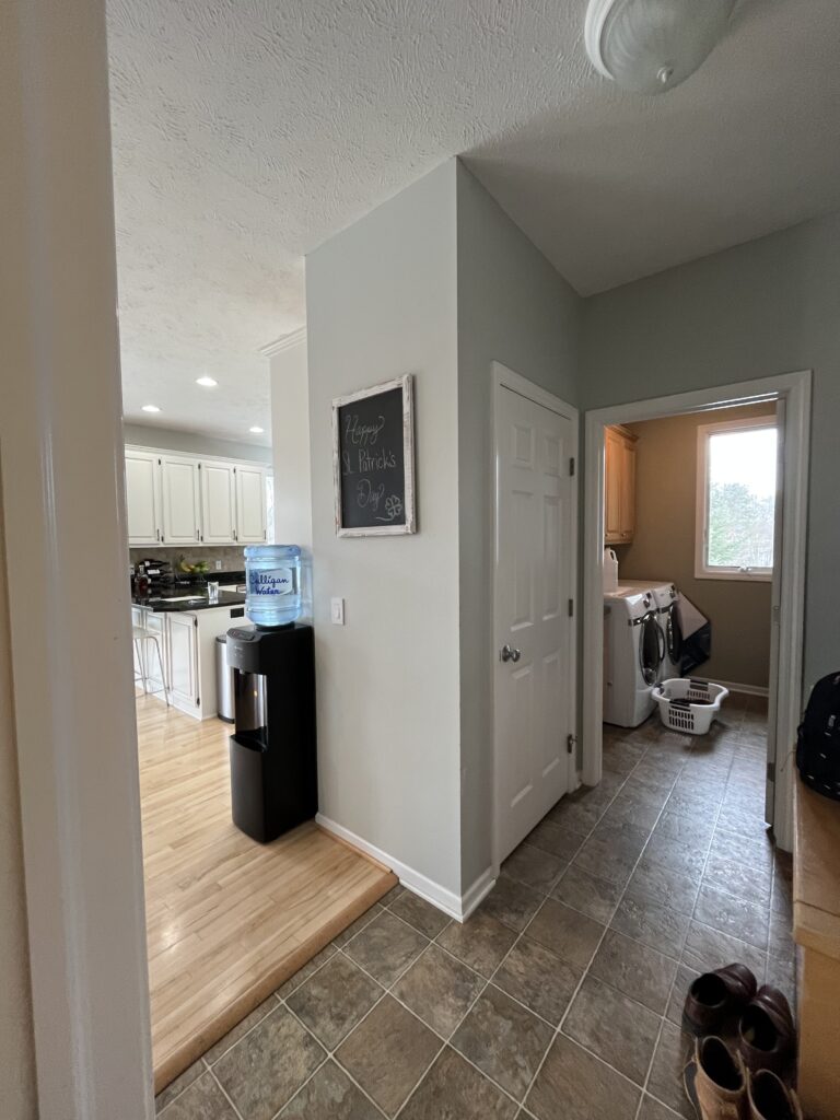
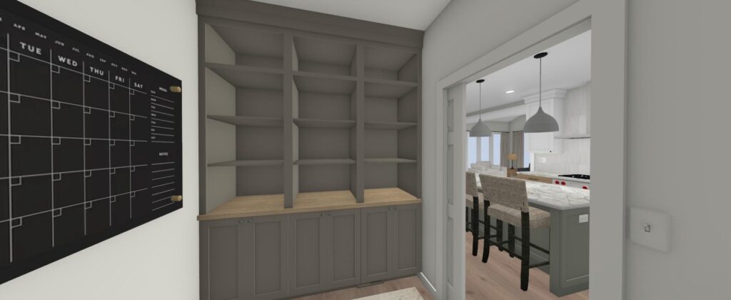
Another benefit to this new layout was providing access to two other adjacent spaces while keeping them semi-private. The locker room didn’t exist without the three doors in the small space impacting how you entered the home. The laundry room was just a galley style that didn’t provide much space to turn around in, let alone have extra storage. Now you can camp out in the walk-in pantry and greet your neighborhood kids when they come through the garage because there is more room allotted to those spaces with a flow that doesn’t create a bottleneck.
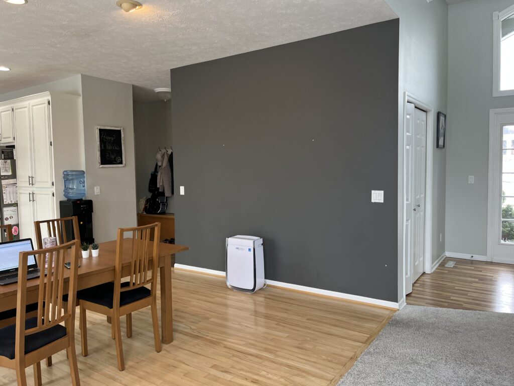
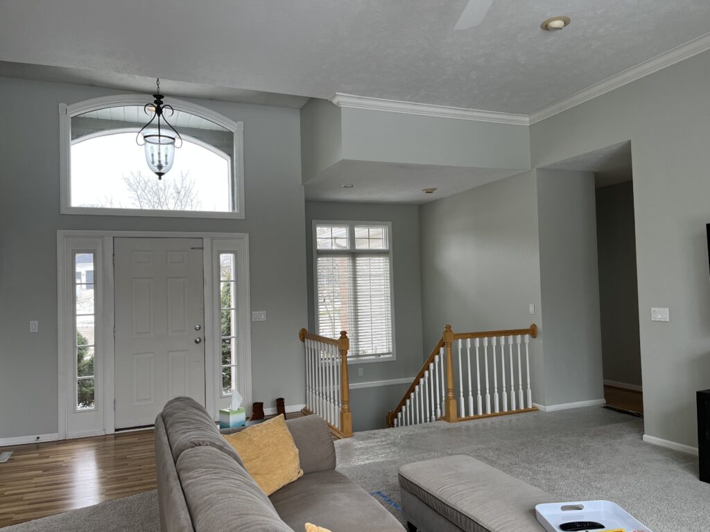
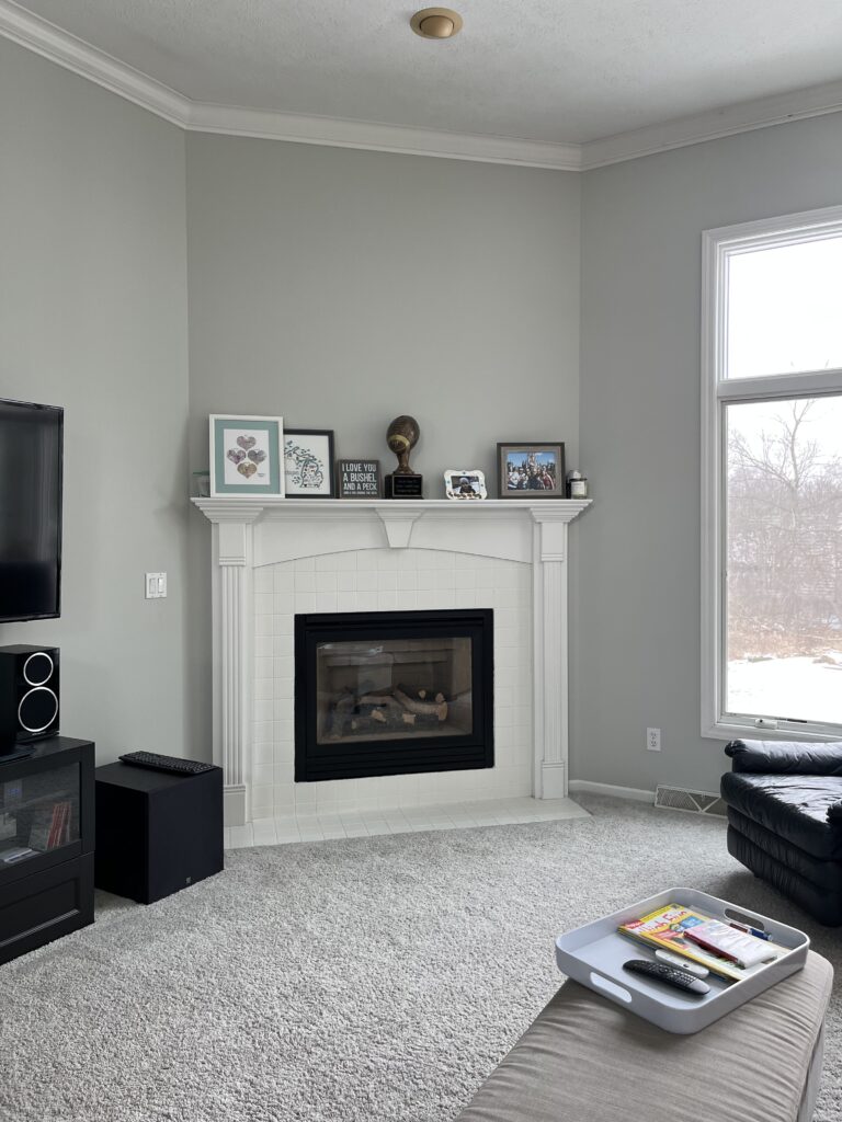
Additionally, they gained a massive wall of display and storage for hosting with a new dry bar. The connection between the major remodel of the kitchen, laundry, and mudroom to the dining and living room where we gave some simple upgrades to the railing, fireplace, and light fixtures transformed the aesthetic and function of the main level of this home.


A well-designed space is only as good as its finishes and the carpentry work. Together with JD Builders INC. (on Alpine), we are so thrilled with the end product. And it showed when the clients were so eager to open their doors on photoshoot day! We simply love what we do and are excited to share it with you. Welcome home!
XO, TTDC