07 Nov Render to Reality | 4 Mile Kitchen
We love a overly crammed, funky, non-functioning kitchen like it’s our business! We also love clients who know they need to see it before committing to a major project like a kitchen remodel. This render to reality is a cute kitchen that needs a breath of fresh air, and more flow to the home
Bold, risky and different are three key words to describe this kitchen wants and wishes. The clients wanted anything besides whites, creams and neutrals. The client also wanted the space to be open to a better working triangle, more open access from the garage to the kitchen and into the dining room. The client also wanted lots of color and a bigger fridge as theirs was a cute little one. They wanted tiled floors, they wanted dark counters and a mix of wood cabinetry tones but how all of this would come together was the million dollar question.
The before photos and layout:


As you can see the sink is crammed in a tight corner and when you pull down the dishwasher you are pinned – leaving no room to move. The stove and double wall oven/microwave combo are back to back with less than 3′ behind each – this meant no two people are working together here. While it may be hard to tell, the fridge was a narrow 30″ and stuck out too far into the main isle from the garage. Too many open cabinets to “display” everything was not their style.
What they did like was a window to look out to their beautiful wooded back yard, a door with immediate access to their back deck, color, tile floor, and a simple open plan. The home has beautiful wood floors with red tones, and while many clients want to remove that look and feel these clients wanted to enhance and tie into it.
The design reveals included two very well thought out plans that checked off all of their wish list, but yet showed two very different layouts.
V1: Opens up the wall between the living room and kitchen for a sink – allowing conversation to carry into other spaces and gives access to see the front door. Provides a island that fits 2-3, located the microwave over the gas range, and puts the fridge in the corner where it is out of the way. This plan also keeps the windows and doors to the exterior as is.

V3 (technically V2):
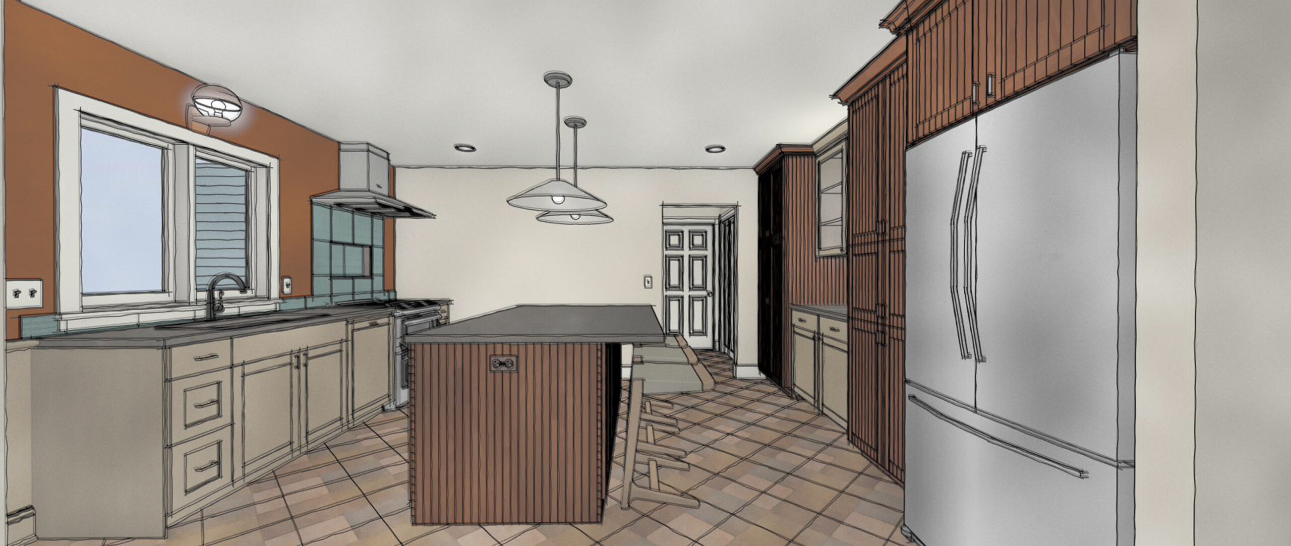
This layout provides a large island with lots of cabinet storage, open walkways, a hidden microwave inside a pantry, a built-in cabinet buffet for decorative elements, the fridge in the corner that everyone can work around, and a sink located at the windows to look outside.

We always love to see which design the clients are drawn towards and what tweaks need to be done to give the clients their dream kitchen. When showing them the options, they liked both very much but one stood out… V3! This gave them so much excitement. Minor tweaks were wall color, flooring tile and countertop color and we were off and running.
The progress photos:


What you can start to feel in these progress photos is the open and simplicity of this kitchen. You can see the flow and how well our visuals in the design process helped these clients stuck to the plan!
RENDER

REALITY

The after’s: Get ready for some color and the final images of this beautiful kitchen!


Check out the full link to this gallery here. We wishing our clients the best time in their new, beautiful and colorful kitchen! Thank you for choosing Times Two Design Co. for your design needs!
Cheers!