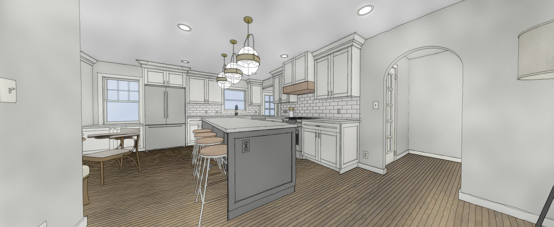
07 Mar Render to Reality | Woodside Kitchen Remodel
It’s not even the same space, let alone the same house! In the internet world of really large spaces, this quaint house and it’s kitchen remodel could compete against any of them! Loads of potential was not the issue here, but the layout was creating dark spaces, pinch points and was simply outdated.
The homeowner isn’t a big cook however, the work triangle could be better. Aside from the obvious style update, it was important to make it more current in its function and storage and open up the spaces to connect better when he hosts guests.
We took out walls and that is always fun but the homeowner wanted us to keep in mind resale value for this house to still appeal to a family. A few requests for no open shelving to collect dust, a kitchen that had ample storage, keep some level of dining room, an island that could accommodate more seating and a functional flow down to the basement since there is a second living space, bathroom and laundry room down there. Scale and proportions for the home was something we played with in the new design to get what felt “right”.
Left floor plan: existing layout Right floor plan: proposed design
Seeing how well an open design worked, quickly eliminated the second design shown to our client which gave space to a mudroom but took too much from the kitchen.
Finishes were chosen to pull every last detail together, appliances were purchased and construction started. Minor changes needed to be made to show a small amount of a beam. When looking at the after photos, you will notice the beam that dies into the molding above the refrigerator. While it’s easy to say that it would look nicer as a smooth ceiling, with any construction there are unforeseen situations that have costs and choices to be made. It’s what makes going into homes so interesting and fun to try and wonder the “why” something was done one way or another. In this case, it subtly defines the dining area and minimally impacts the molding at the cabinets. A win on a big decision!
Now the space is so inviting from the moment you enter the front door and so functional when you enter from the garage. The flow is fantastic with multiple ways to get from the one space to another. The storage is even better than it was before and now includes a bonus coffee station. No windows were altered but the light pouring through the spaces is incredible! The living room is spacious and open to multiple furniture layouts all while being connected to the kitchen and dining spaces.
Welcome to this sweet kitchen transformation that has checked all the boxes and feels like home. We love it when something feels like it was always meant to be! Check out the full gallery here.
Builder credit: JD Builders


